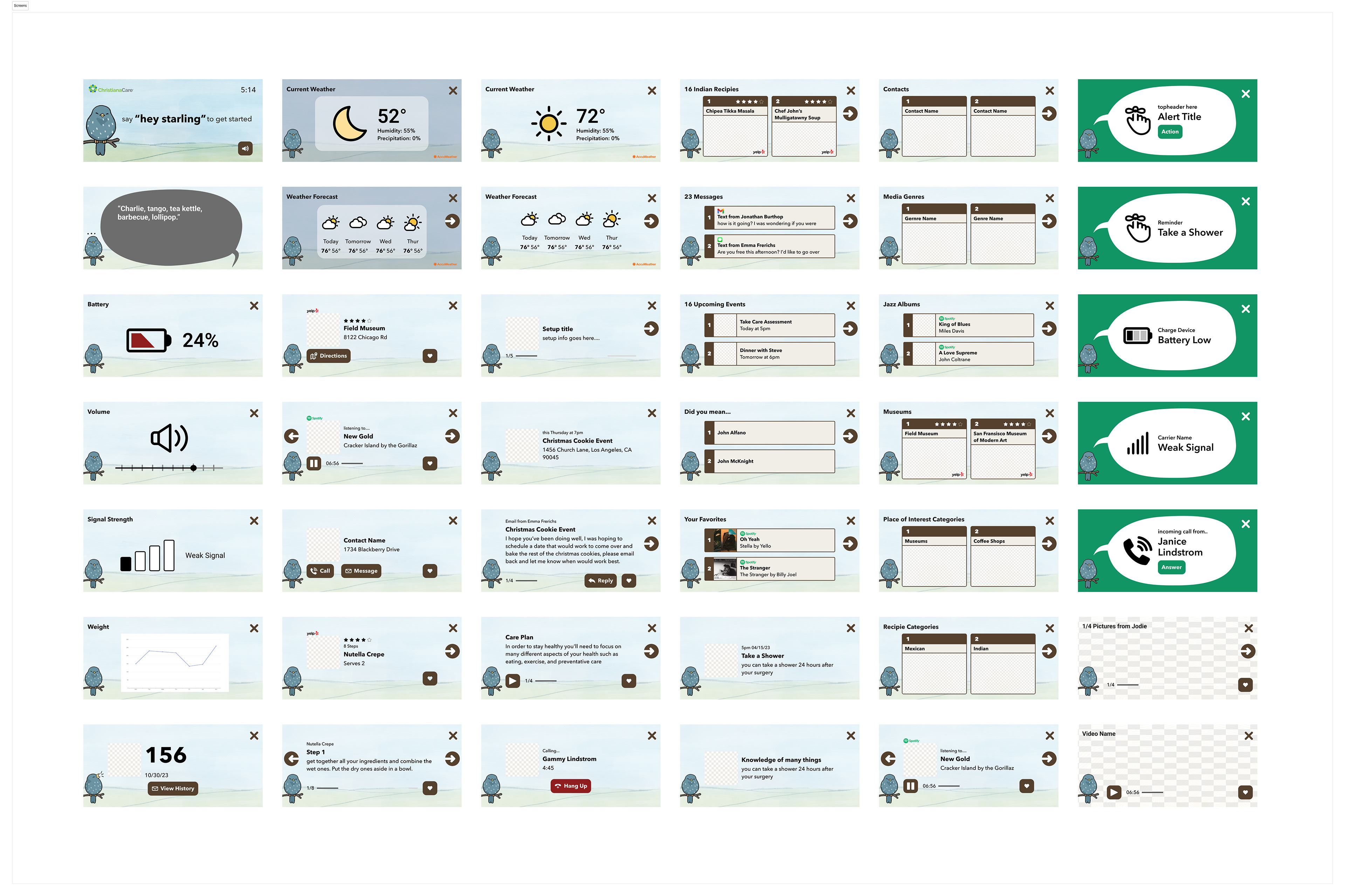
Starling CARE's mission is to enhance the lives of millions of older adults across the United States by providing a customized healthcare assistant securely within their homes. Starling CARE is a tabletop tablet voice assistant that connects doctors with patients and helps reinforce healthy, life-changing habits.
My task as lead designer for Starling CARE was to craft a comprehensive design system that provides the stable, familiar, and accessible user experience required by its older adult customers. Additionally I had to scope out a design system that was flexible to the needs of 30+ different screen types.
During the development of the Starling CARE design system, I conducted several user research sessions with 29 residents from my grandmother’s living community, all possessing unique needs.
Through these interviews I learned about their pains they had with their current healthcare solutions. They loved how technology connected them with their loved ones, but hated the overwhelming experiences that most solutions provided.
Some of the most common issues mentioned were:
- confusion around how to reply to loved one's messages
- difficult finding favorite images from message threads
- difficulty remembering their health plan
- feeling uneasy while navigating online
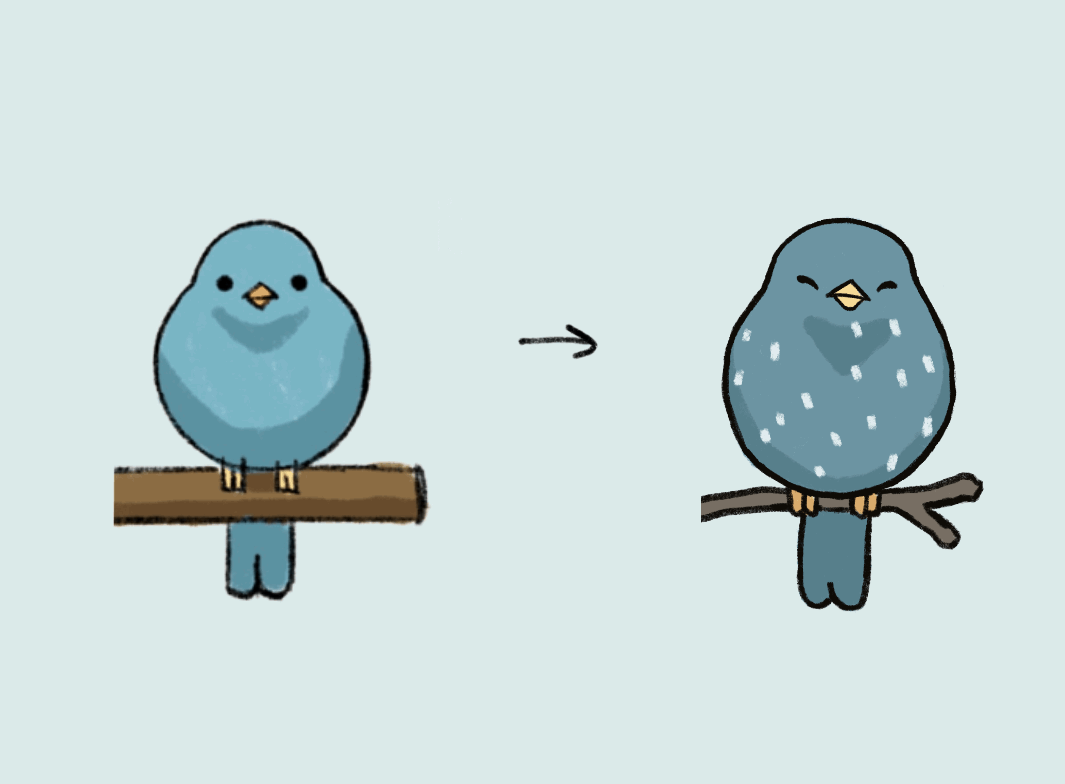
One of the key elements of putting our users at ease was having a likable Starling assistant. Below is a simple wireframe prototype I used for user research interviews. Use the arrows to see different versions of Starling. Can you guess which one I hated but almost everyone else loved?
My task as lead designer for Starling CARE was to craft a comprehensive design system that provides the stable, familiar, and accessible user experience required by its older adult customers. Additionally I had to scope out a design system that was flexible to the needs of 30+ different screen types.
During the development of the Starling CARE design system, I conducted several user research sessions with 29 residents from my grandmother’s living community, all possessing unique needs.
Through these interviews I learned about their pains they had with their current healthcare solutions. They loved how technology connected them with their loved ones, but hated the overwhelming experiences that most solutions provided.
Some of the most common issues mentioned were:
- confusion around how to reply to loved one's messages
- difficult finding favorite images from message threads
- difficulty remembering their health plan
- feeling uneasy while navigating online
One of the key elements of putting our users at ease was having a likable Starling assistant. Below is a simple wireframe prototype I used for user research interviews. Use the arrows to see different versions of Starling. Can you guess which one I hated but almost everyone else loved?
Despite most of my initial explorations being of side facing birds, 21/29 of my interviewees expressed an instant fondness for the forward facing borb of a bird. Our Starling assistant had found her look.
Another interesting insight from user research interviews was that older adults preferred clean, bold, san serif fonts as opposed to a serifed alternative. While this news might not surprise some, it surprised me. Interviewing my user group helped me check my own biases and kept my design focused on my intended user.
These insights became integrated into a flexible design system capable of adapting to the wide range of user scenarios with Starling CARE.
These insights became integrated into a flexible design system capable of adapting to the wide range of user scenarios with Starling CARE.