Overview
A voice AI for the people most likely to distrust it.
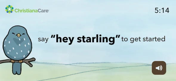
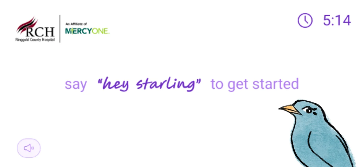
Starling CARE is a tabletop tablet voice assistant that connects doctors with patients and helps older adults maintain healthy habits within their homes or assisted living facilities. It's a healthcare AI product built for one of the hardest user populations imaginable: people who may have limited mobility, declining memory, anxiety around technology, and real consequences if the product fails them.
The challenge
Voice AI has a design problem. Most voice interfaces are designed for the median user — someone comfortable with technology, with clear speech, who can troubleshoot when something goes wrong. Older adults in assisted living don't fit that profile.
- Varying degrees of cognitive decline affecting memory and processing
- Motor limitations affecting how they interact with screens
- Low to no prior experience with AI assistants
- Real healthcare stakes — this product was involved in their care
The design challenge wasn't "make a good app." It was: make an AI-powered healthcare assistant that earns the trust of people who have every reason to distrust technology.
User Research
Not proxy research. 29 real people in their actual environment.
I didn't recruit representative users or run remote surveys. I conducted in-person research sessions with 29 residents from my grandmother's assisted living community — people with genuinely diverse needs, not a filtered sample.
This mattered. Proxy research for vulnerable populations produces proxy insights. Getting into the actual environment — seeing how residents held a tablet, hearing the pace at which they processed information, watching the moment confusion turned to frustration — shaped every design decision that followed.
"I want to stay connected to my family, but I don't know where to start."
Research participant — assisted living resident
What I heard
The consistent tension: residents loved that technology could connect them with family and manage their health. They hated the feeling of being overwhelmed. The same product created both experiences.
- Confusion about how to reply to a loved one's message
- Difficulty finding a favorite photo buried in a message thread
- Struggling to remember their health plan or medication schedule
- Feeling uneasy and anxious while navigating anything unfamiliar
The design brief that emerged from research: stable, familiar, and never overwhelming. Every screen needed to communicate "you are in the right place and you know what to do next."
Research scope
Key Decision 1
I was wrong. The users were right.
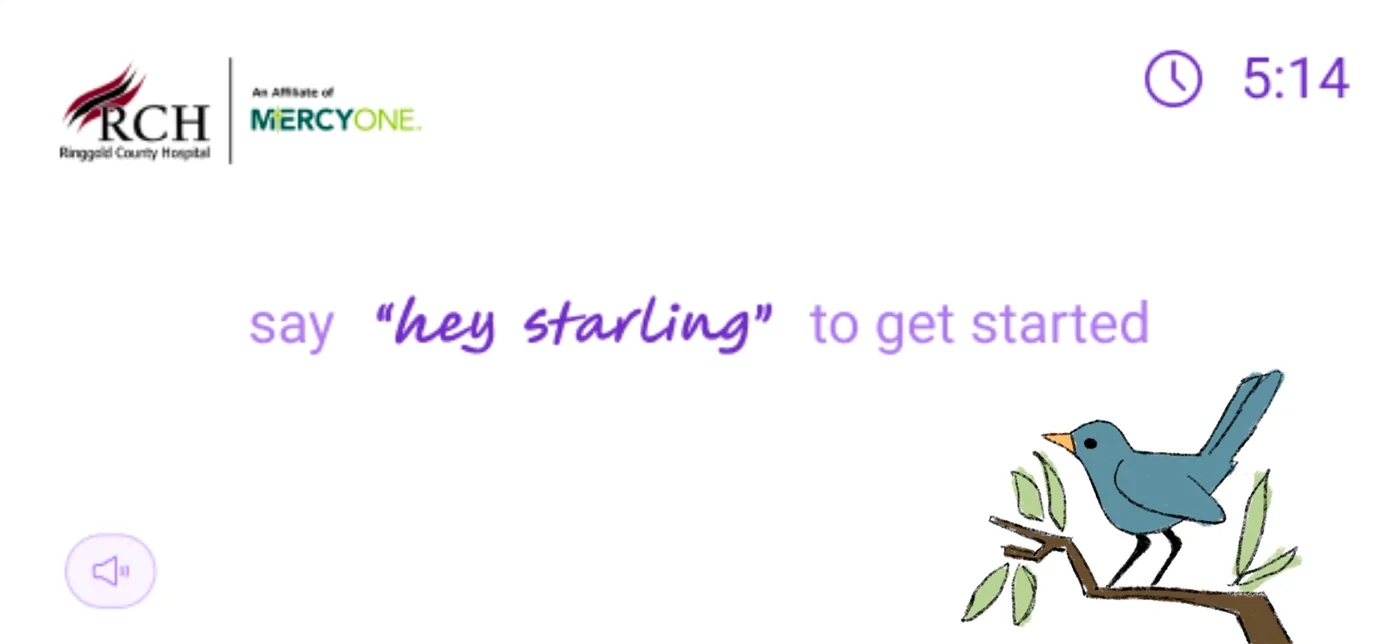
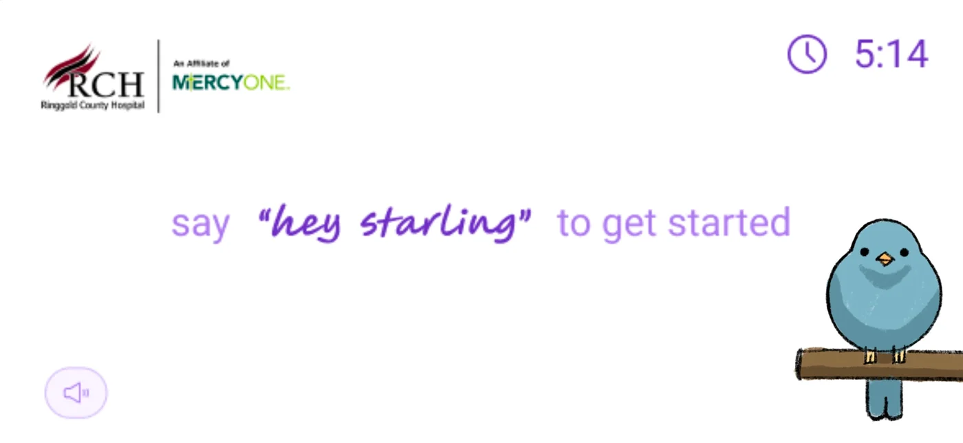
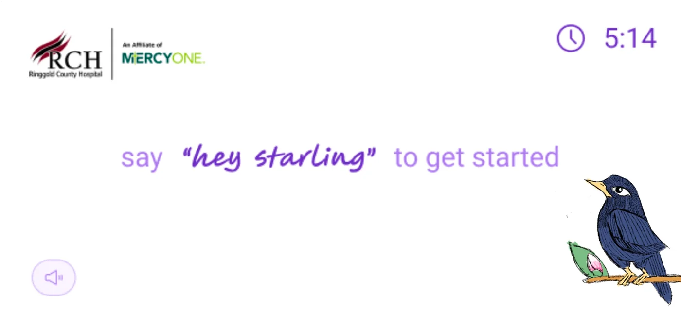
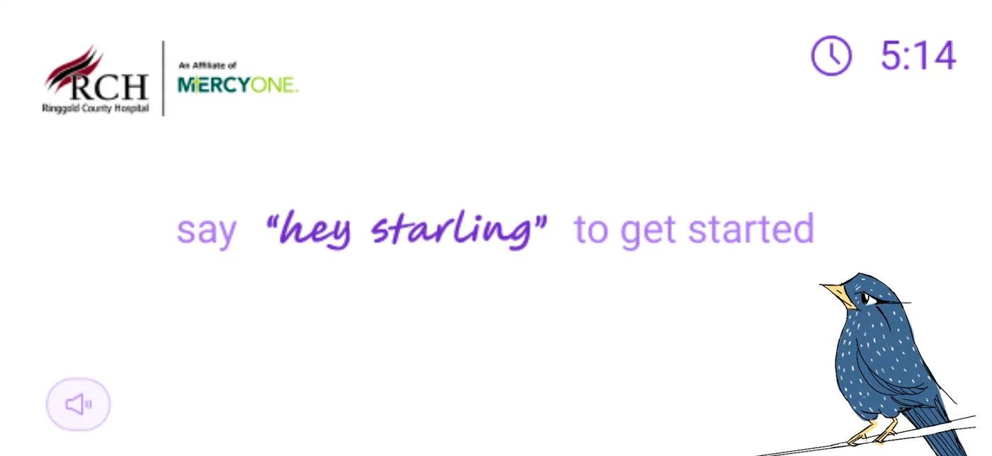
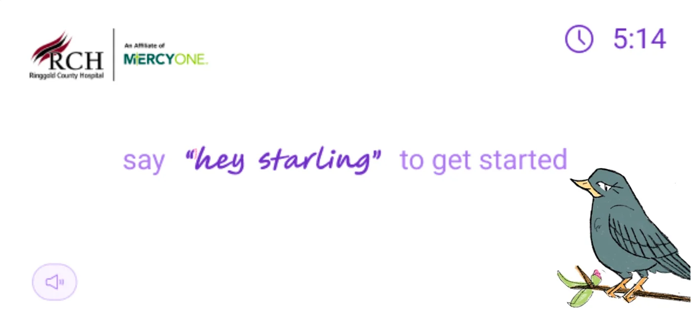
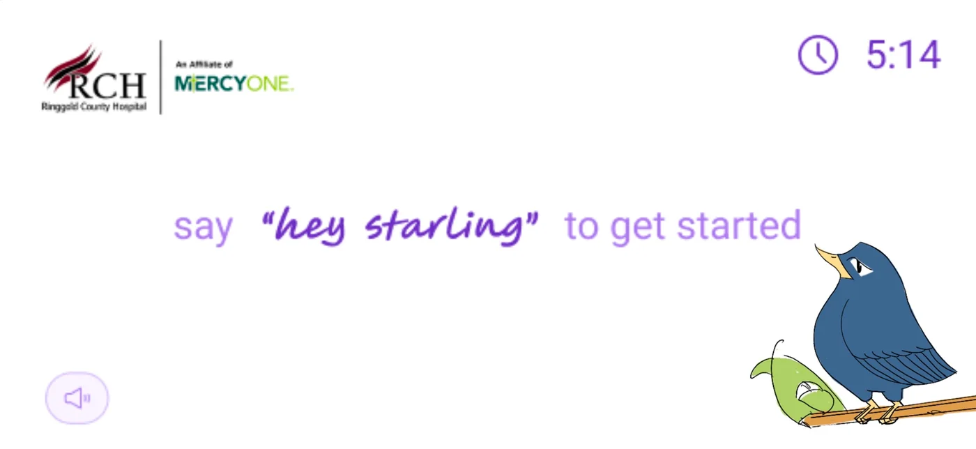
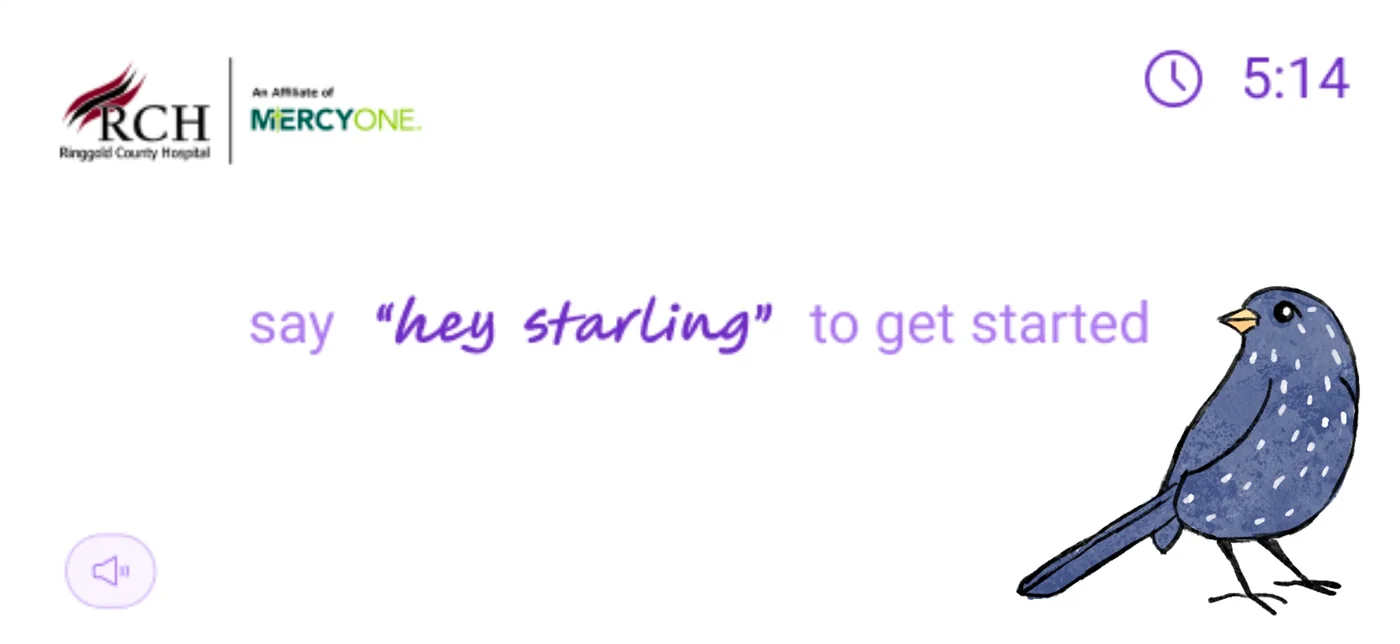
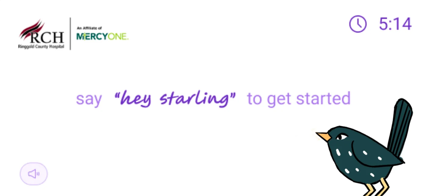
One of the first questions was whether Starling needed a character — and if so, what it should look like. I explored multiple directions: side-facing birds (more illustrative, editorial), abstract icons, and forward-facing character designs.
I brought these to user research expecting the more editorial options to resonate. 21 out of 29 residents immediately expressed fondness for the forward-facing bird. The side-facing options I preferred barely registered.
Research outcome
This set the tone for the entire project: design for your users, not for your portfolio. The forward-facing bird became Starling's identity because 29 real people told me so — and I was paying attention.
Typography: checking my own biases
A standard design instinct says serif fonts feel warm, human, and trustworthy — appropriate for a healthcare product. I came into research expecting this to be confirmed.
It wasn't. Older adults consistently preferred clean, bold, sans-serif typography. They found serif fonts harder to read and more visually cluttered. My assumption was wrong. The design system reflects what users needed, not what I expected.


"I can actually read this one."
Research participant — on the sans-serif direction
Key Decision 2
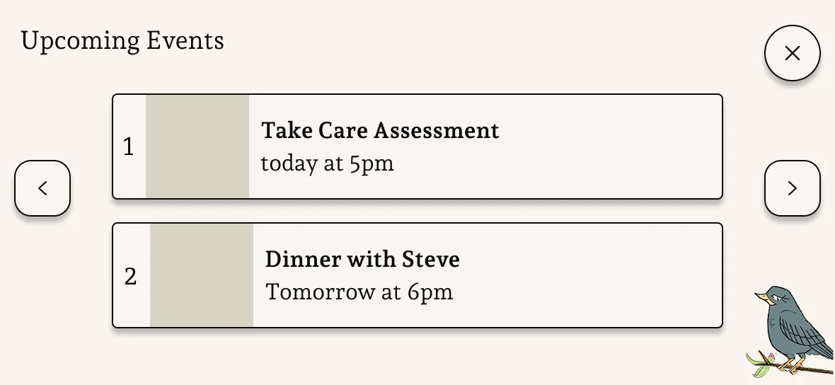
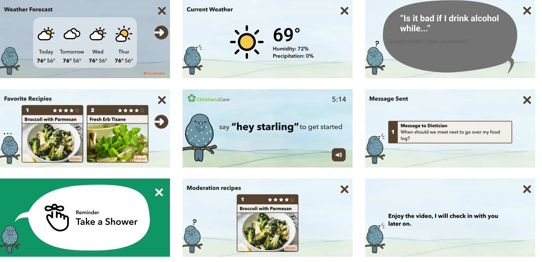
30+ screen types. One visual language that never surprises.
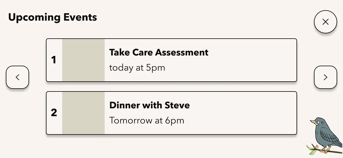
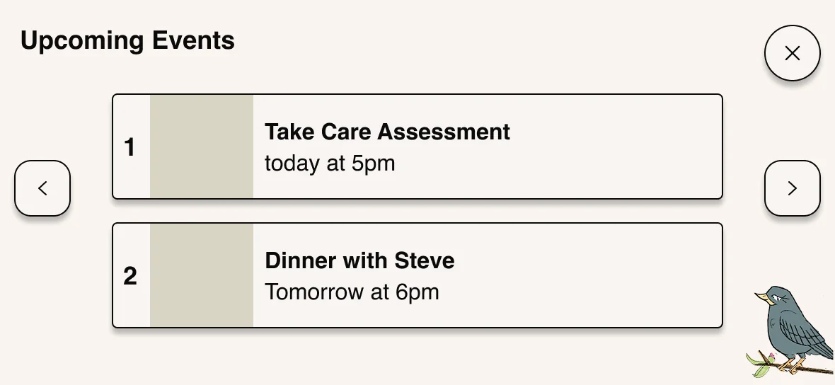
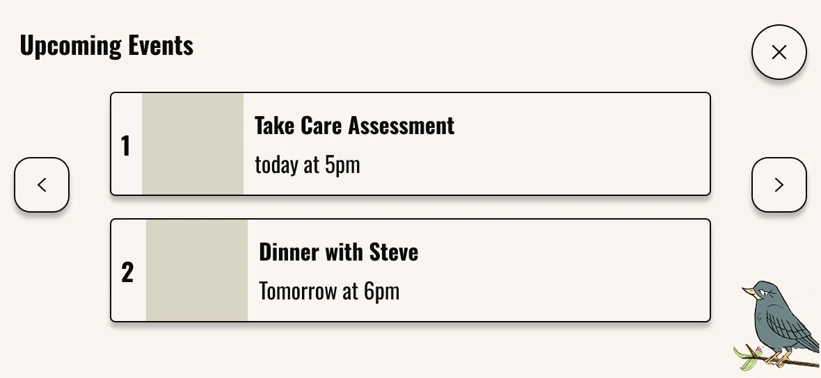
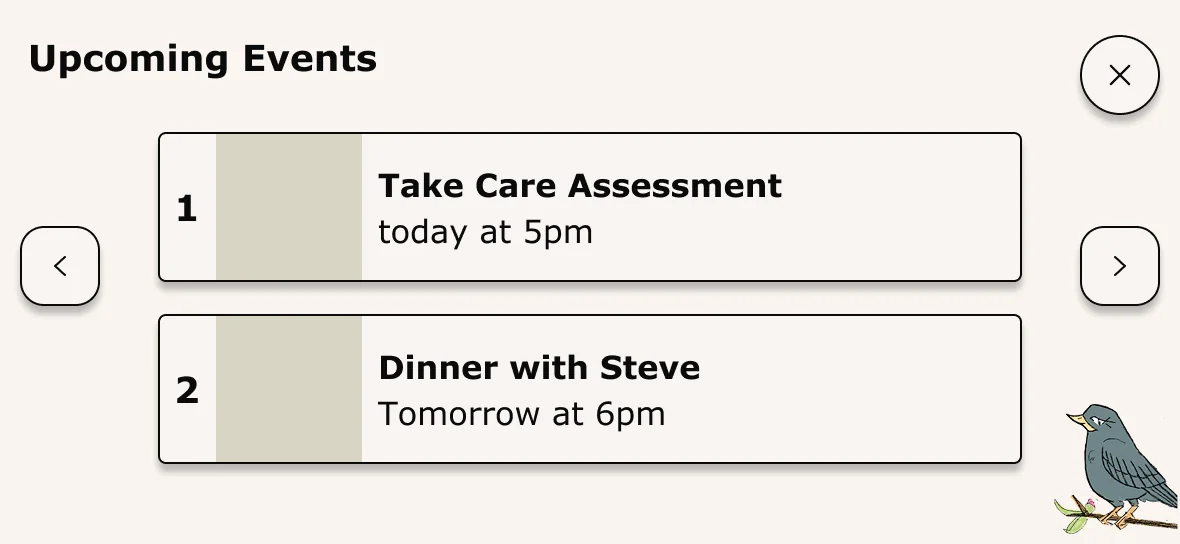
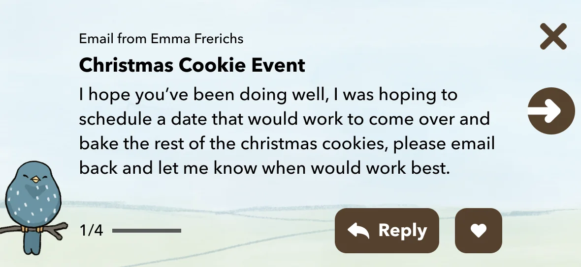
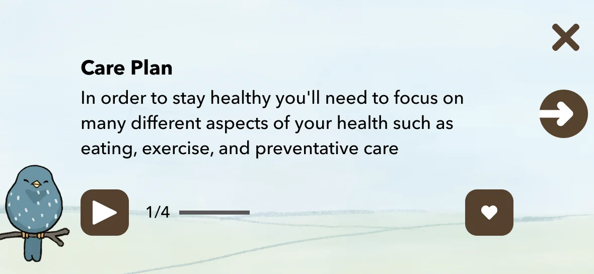
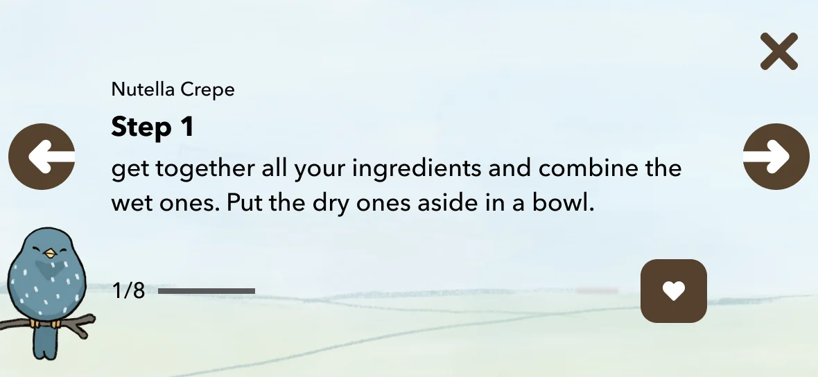
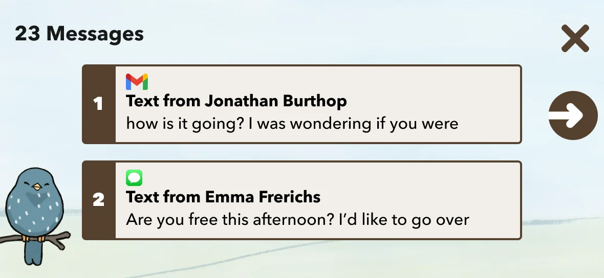
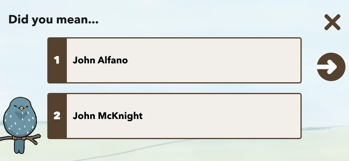
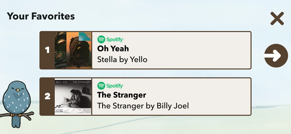
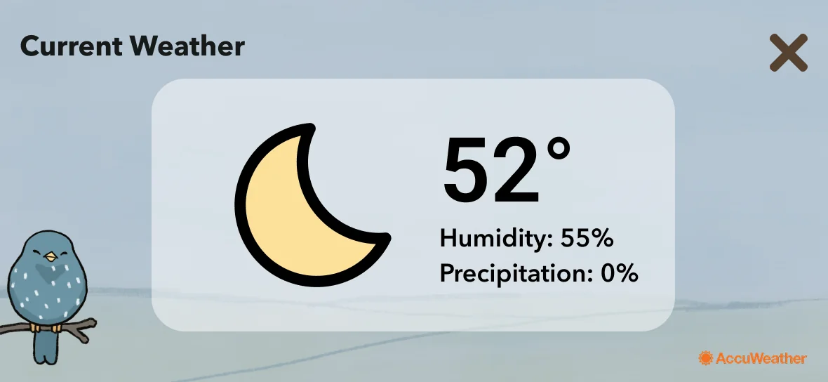
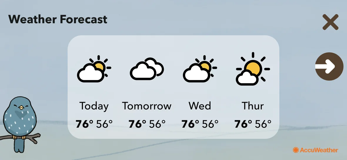
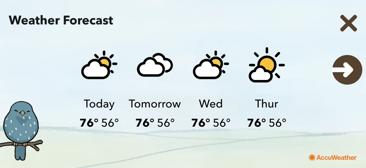
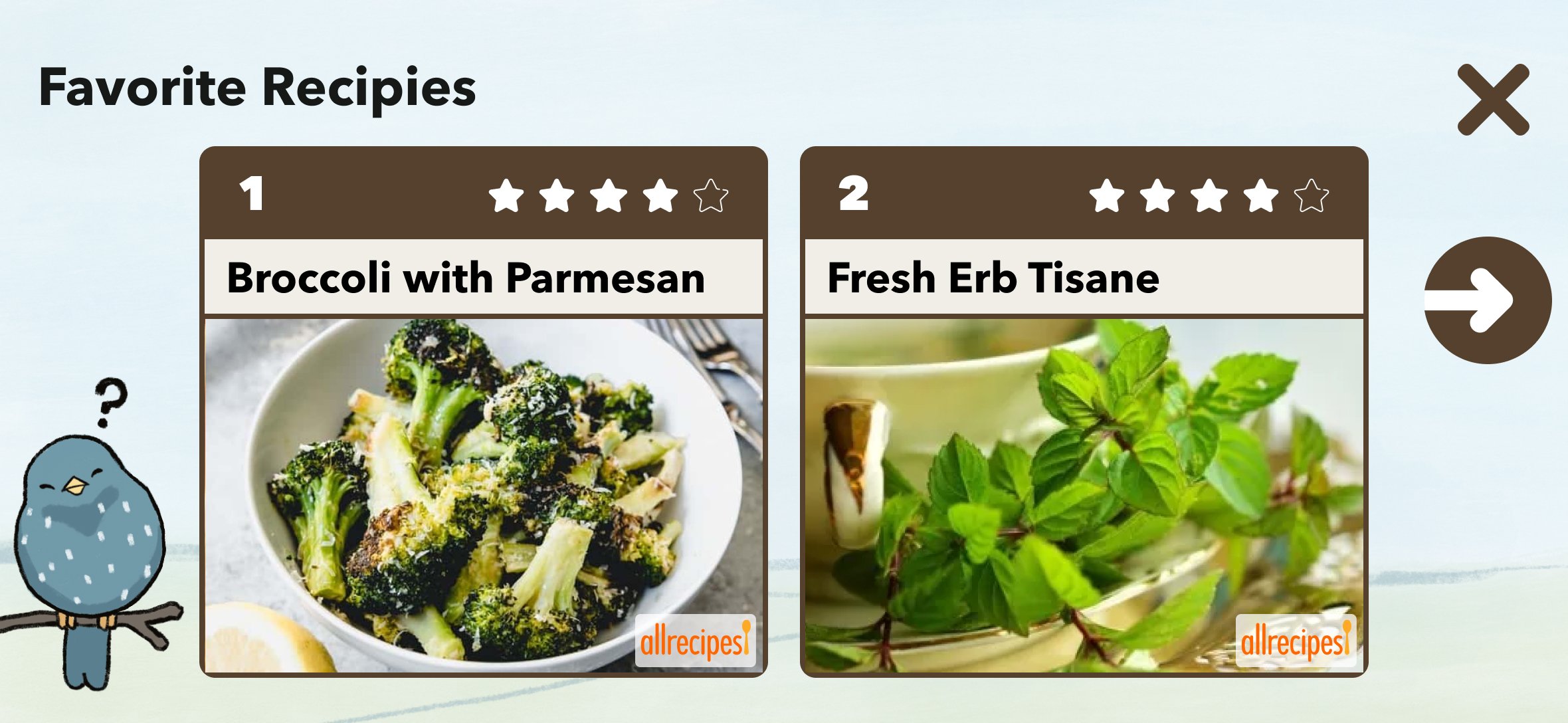
Starling CARE covers a wide range of healthcare scenarios: medication reminders, doctor check-ins, family messages, health habit tracking, emergency contacts. Each scenario has its own screen type, interaction pattern, and emotional register.
The challenge was building a system flexible enough to handle all of these while maintaining the stability users needed. For users with cognitive decline, inconsistency isn't just a UX problem — it's a trust problem. Every screen needed to feel like it belonged to the same product.
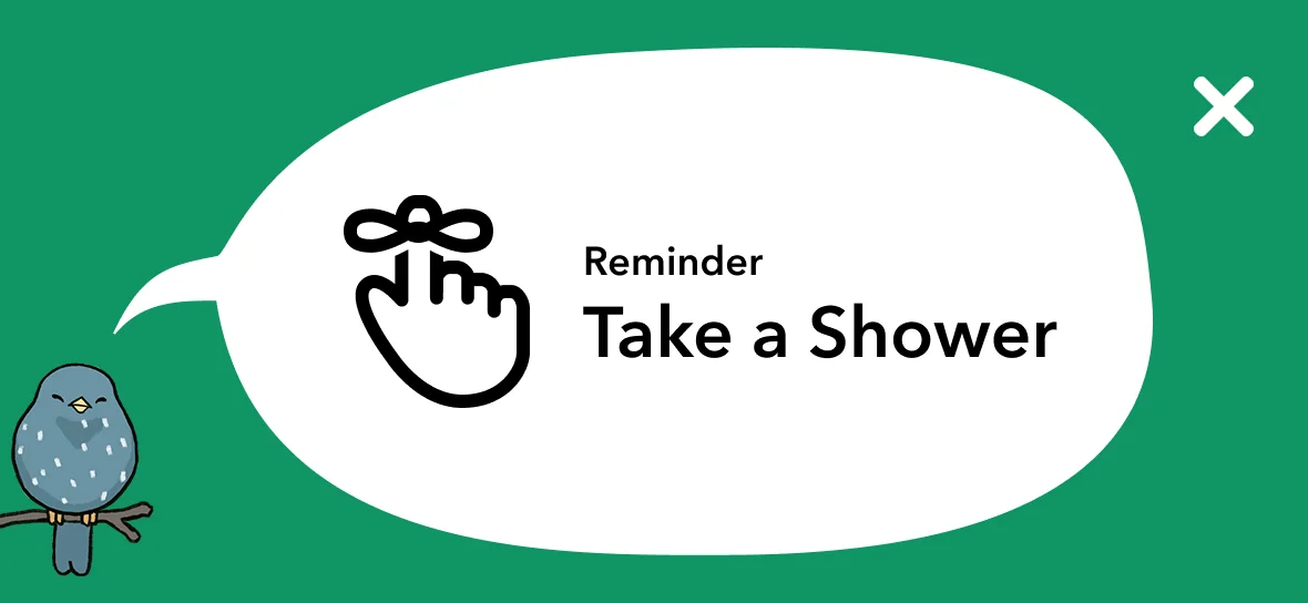
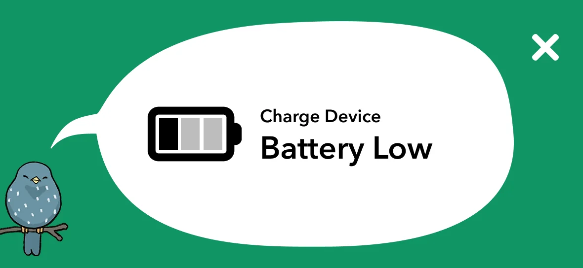

System principles
Large tap targets throughout
Motor limitations required generous interactive areas — not a nice-to-have, a baseline requirement.
Minimal options per screen
Never more choices than necessary at any step. Cognitive load is a design constraint, not a preference.
Consistent navigation — always
Same back button, same home indicator, same position, every time. Predictability builds confidence.
High contrast as baseline
Accessibility wasn't a feature to add at the end — it was the starting point for every screen. If it didn't pass, it didn't ship.
Key Decision 3
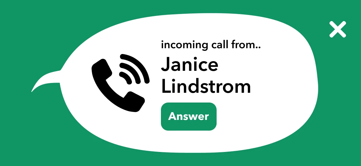
Voice and touch as equals — neither is the fallback.
Starling is fundamentally a voice product — but users don't only interact by speaking. The challenge was designing an experience where voice and touch were both first-class, and where the transition between them felt natural rather than jarring.
For users who struggled to initiate speech — anxiety, cognitive hesitation, unfamiliarity — the visual interface had to provide a clear on-ramp. For users who couldn't reach the screen reliably, voice had to handle the full interaction. The system needed to support both paths without making either feel like a fallback.

"I didn't have to touch anything — it just listened."
Research participant — on the voice interaction
Learnings
Designing for the hardest users produces better design for everyone.
The constraints of designing for older adults with cognitive and motor limitations forced me to strip out complexity I would have left in for a general audience. The result — simple, stable, high-contrast, voice-forward — is better UX for any user. Stress, distraction, and unfamiliarity don't only affect older adults.
The most important research is the kind you can't fake
Sitting with 29 real people in their actual environment taught me things no usability test would have surfaced. The mascot choice, the typography preference, the anxiety around navigation — these came from presence, not protocol.
Checking your own biases is part of the job
I was wrong about the mascot. I was wrong about the typography. The research saved me from shipping my preferences instead of my users' needs. That's what research is for.
Trust is a design material
For users with real stakes — healthcare, memory, anxiety — trust isn't a byproduct of good UX. It's the primary deliverable. Every decision I made was evaluated against one question: does this make the product feel safer?