Overview
Accessibility isn't a feature. It's the whole product.
CalFresh is California's SNAP program — up to $298 a month in grocery benefits, loaded onto an EBT card, available to low-income students who qualify. At Cal Poly SLO, roughly 1 in 3 students meets the eligibility threshold. But participation was chronically, stubbornly low.
The research was clear on why. Stigma was the number one reported reason students didn't apply — embarrassment about needing help. Close behind it: the application process felt confusing and bureaucratic, and a significant portion of eligible students had simply never heard of CalFresh at all.
- Stigma: self-reported embarrassment was the top reason eligible students didn't apply
- Complexity: the multi-step application confused students about whether they even qualified
- Low awareness: 40% of eligible college students had never heard of CalFresh
- No consistent visual identity: outreach materials lacked cohesion and professional trust signals
My role was to close those gaps — not by explaining the application better, but by making CalFresh feel approachable, normal, and worth the five minutes it took to start.
Brand System
Before we could change behavior, we needed a consistent voice.
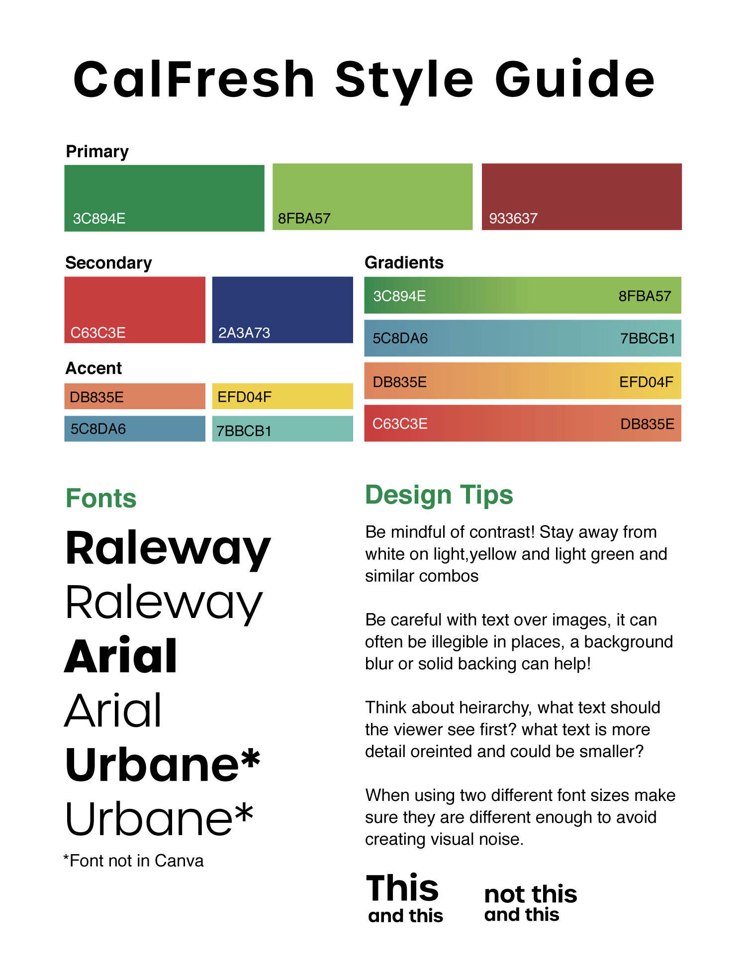
The first thing I built was a brand foundation. Outreach materials were inconsistent in color, typography, and tone — which undermined trust and made the program look scrappy rather than legitimate. Students who already felt uncertain about asking for help needed to see something that felt put-together and credible.
I developed a style guide that standardized the visual system: a primary palette anchored in CalFresh's program green, a secondary warm red and navy for contrast, and accent colors that gave seasonal campaigns room to breathe. Typography paired Raleway's geometric confidence with Arial's accessibility-friendly readability.
The guiding principle
Every design decision ran through one filter: does this make it easier or harder for a student who's never asked for help before to take the next step? That meant warm over clinical, peer-voice over institutional, and bold enough to stop a scroll.
Events & Print
Getting out there — in person and on paper.
Social reach only goes so far. The highest-impact outreach happened in person, where students could ask questions and get help on the spot. My job was to design materials that made those moments happen — event promotion that was impossible to scroll past, and informational print that made a complicated benefit legible at a glance.
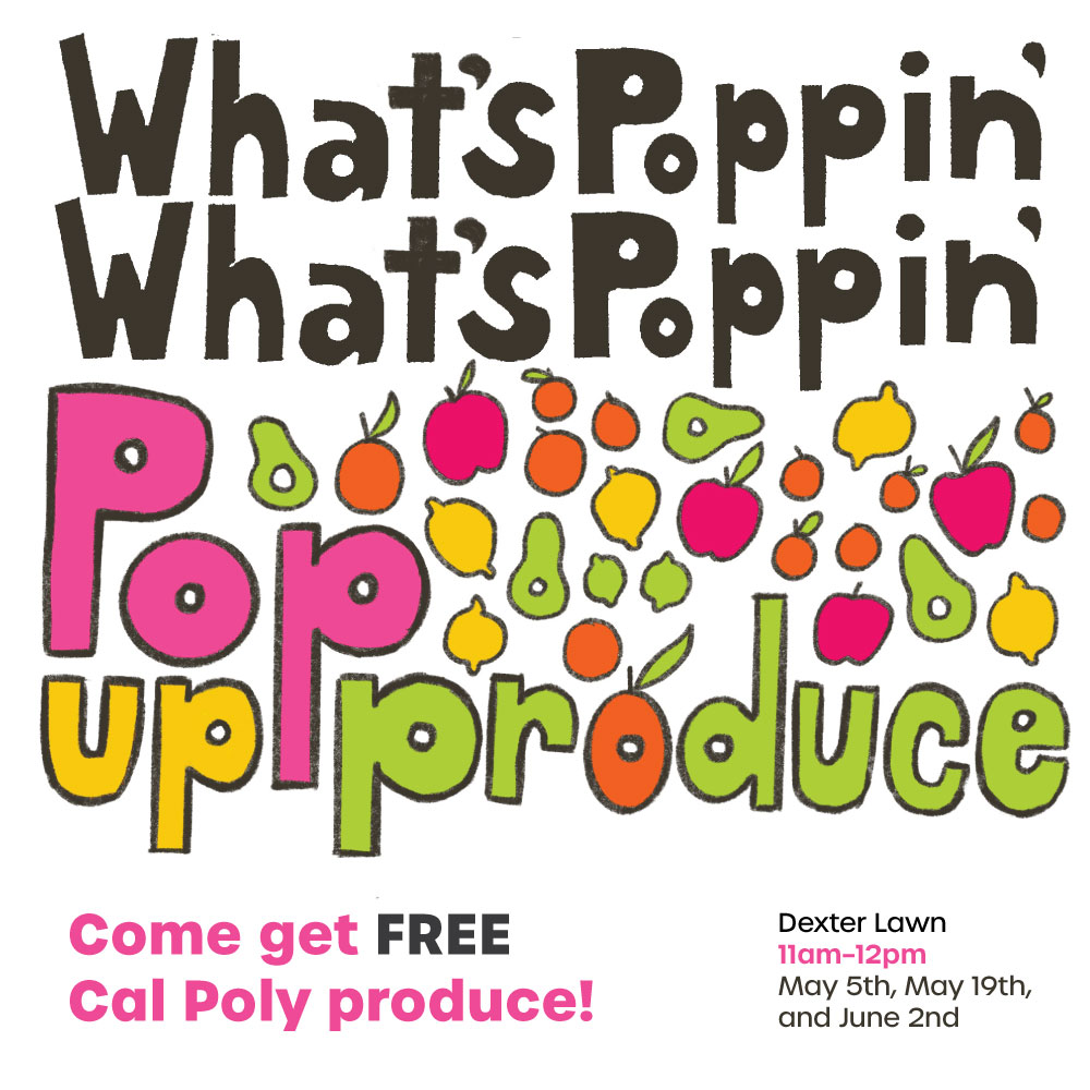
Pop-Up Produce
The Pop-Up Produce events gave students free campus produce with no application required — a low-barrier entry point that got students in the same physical space as outreach team members. The design needed to feel festive and inviting, not transactional.
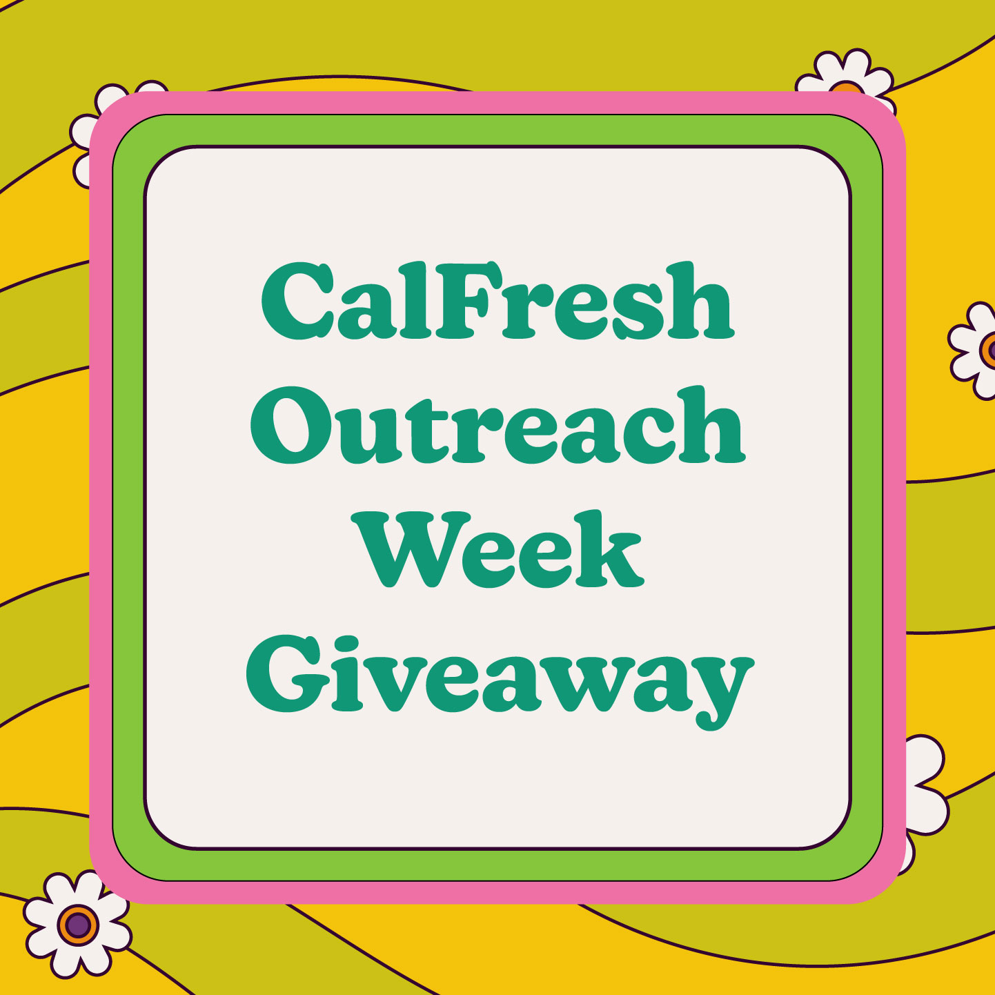
CalFresh Outreach Week
Outreach Week was the program's highest-visibility moment of the year — a full week of tabling, drop-in appointments, and activities designed to drive application volume. I designed the promotional content across Instagram and print, keeping the visual language loud enough to compete with everything else happening on campus.
Informational print
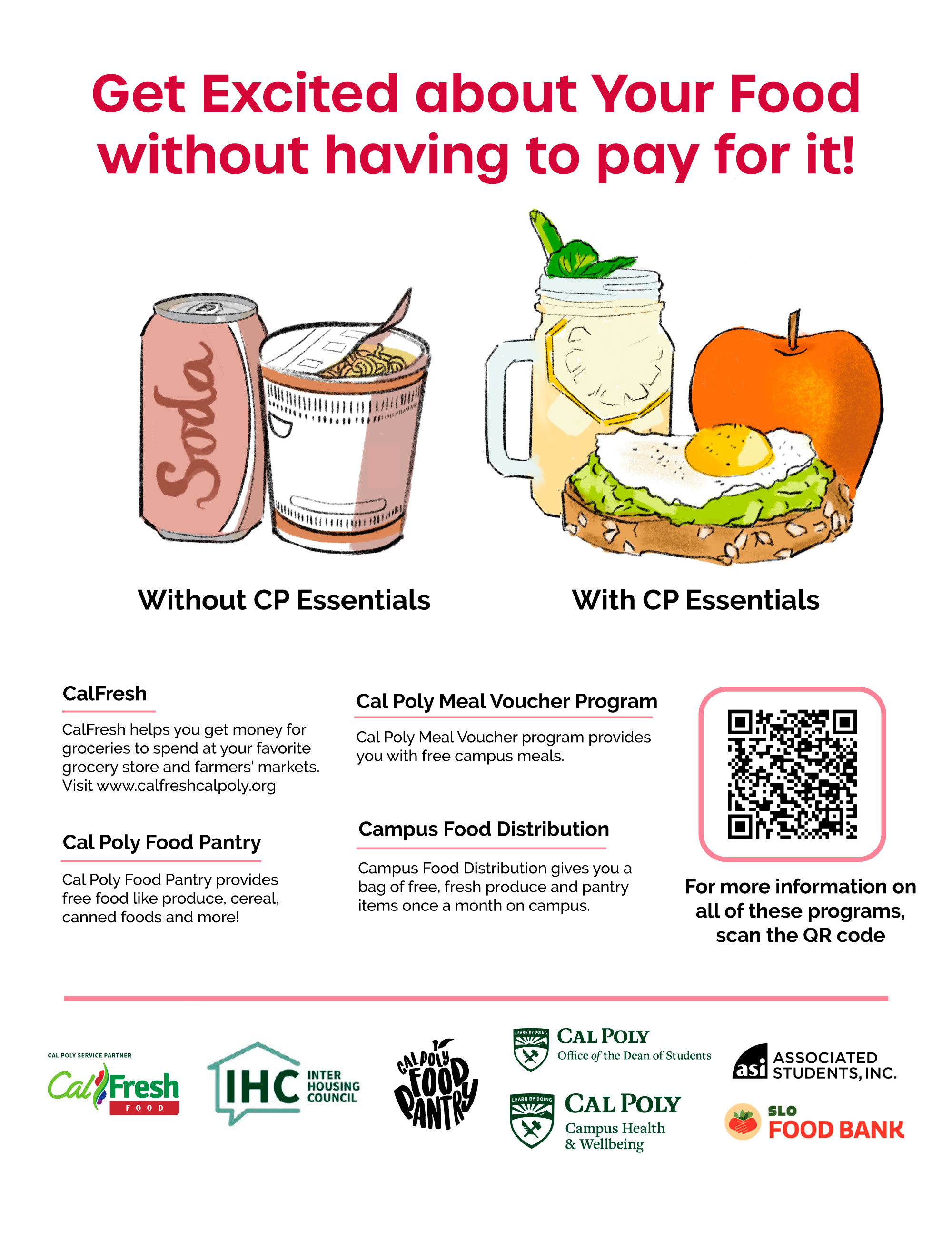
The "With or Without" flyer was one of the highest-distribution print pieces — handed out at tabling events and posted around campus. Its job was to answer the most common question students had: what do I actually get? Laid out in plain language with a clear visual comparison, it reduced the perceived complexity of a benefit students often assumed wasn't worth the paperwork.
Impact
Design doesn't fix a system. But it can open the door.
The CalFresh participation gap at Cal Poly didn't close because of any single flyer or campaign. It closed incrementally — every time a student saw a post that made them feel less alone about needing help, every time a well-designed event brought them into a space where they could ask questions, every time a clear print piece made the benefit feel real and worth pursuing.
By the time I left the program in 2022, Cal Poly CalFresh Outreach was helping over 1,500 students annually connect with benefits — building toward the 1,635 students assisted in the following academic year. The social channels had grown to 4,200+ followers. The visual system I built was actively in use across every platform.
The lesson I took from this work — and still apply today — is that accessibility isn't a design constraint. It's the design goal. When you remove the friction between people and something they need, the impact follows. That principle held for a food assistance flyer in 2021, and it held for an AI interface at a healthcare startup in 2024.
Social Campaign
Normalizing the ask, one post at a time.
The most powerful thing social media could do for CalFresh wasn't explain the application — it was make students feel like applying was normal. That it wasn't embarrassing. That other students just like them were already doing it.
I designed content that met students where they were: funny, relatable, visually distinct, and always grounded in a real student benefit. Retro illustration styles made the content feel warm and human rather than bureaucratic. Real student quotes gave it social proof. Holiday and seasonal campaigns kept the account active and worth following year-round.
Quote-based content
Student quotes were the most effective format we used. A peer saying "I didn't have to choose between gas and groceries" communicates more than any benefit explanation — it removes shame by showing someone else already asked, and it names the real-world tradeoff CalFresh eliminates.
Holiday campaigns
Seasonal content kept the account relevant outside of peak application periods. The CalFresh Holidays campaign reframed food benefits through the lens of celebration — using rich food imagery and playful copy to remind students that the program existed even when they weren't actively thinking about applying.
The holiday series used food as the emotional hook — shifting the conversation from need to abundance, and from stigma to celebration.
CalFresh Holidays — musical campaign
The holiday lyric series took seasonal familiarity one step further: rewriting holiday songs with CalFresh benefits as the punchline. Playful, shareable, and impossible to take too seriously — which was exactly the tone needed to make food assistance feel less fraught.
Left: holiday lyrics campaign. Right: real-time event stories kept followers informed about drop-in hours and campus opportunities.
Community content and call for submissions
The CalFresh Outreach Zine was a community-building project that invited students to share their relationship to food, cooking, and campus life. Designing the call for submissions meant creating something energetic enough to spark interest and clear enough to actually drive entries.